Whether you’re heading to a trade show, conference, or a client meeting, having a business card to share can give you an edge over others. The trouble is, everyone else probably has one, too. So many cards means that 88% of them get thrown out within a week.
Carefully planning and making an effective design is the key to keeping your card out of the garbage bin. Follow these steps to easily make a business card people will remember.
1. Sketch It Out
The best business cards begin at the drawing board. Even if you’re not artistically inclined, it helps to make a few sketches. Use them to map out elements of your card. You’ll find the actual card-making process a lot easier if you have visual references of what you want.

Although the classic 3.5” x 2” rectangle is still popular, a lot of business cards nowadays come in many shapes and sizes. Some people opt for square cards, while others spruce up the standard rectangle by adding rounded corners. Consider your business card budget when deciding on a layout; unconventionally shaped cards can cost a bit more money to print.
2. Go Digital
Once you’ve made a sketch you like, it’s time to get on the computer. There’s lots of software available that you can use to design your card, if you want to start from scratch. Before you begin, make sure your file and card dimensions match, otherwise the final product might not print correctly.
If freeform design isn’t your thing, don’t worry! Companies like Vistaprint, MOO, and GotPrint have many premade card templates to get you started. Simply enter your text, upload your logos, and you’re good to go.
3. Choose the Right Words
There’s only so much you can say on one card. Word overload is overwhelming to the eye and, for some, appears unprofessional. Stay away from clutter by sticking with basic info, like your name, job title, phone number, and email. Grouping together relevant blocks of text cleans up your card and makes it easier for readers to find the information they need at a glance.

Source: ICS
Font choice is just as crucial as the words you use. Fonts are the visual equivalent of the phrase, “It’s not what you say, but how you say it.” Studies show that people assign emotions to specific typefaces. Some examples include:
Serif: mature, traditional, respectable.
Sans serif: clean, professional, stable.
Script: elegant, sophisticated, fluid.
Modern: strong, progressive, stylish.
Display: amusing, imaginative, creative.
It’s tempting to play around with fancy fonts, but you should stick with ones that match your overall brand image.
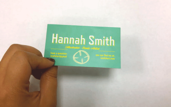
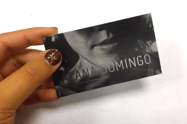
4. Add Some Visuals
We all know color profoundly affects marketing strategies, so it’s really no surprise that color choice alters your business card’s lifespan. In fact, colorful cards last 10x longer than the typical black and white ones.
Be aware that colors might not print the way they look on your screen. Some colors might blend together, making your text hard to read. Use contrasting colors to make your words pop from the background and reduce reader eye strain.
Source: HRS Illustration
To avoid color-printing mishaps, graphic designers recommend using the CMYK color profile for business card printing. The CMYK profile mixes cyan, magenta, yellow, and black ink to create thousands of hues, resulting in high quality, accurate prints.

Source: Archangel Media
Incorporating images into your business card is another way to hold people’s attention. Company logos, photos, shapes, and illustrations are all good elements to consider putting on your card. Original, high resolution images are best, but if you really want to use a picture you found online, make sure you get permission first.
5. Put on the Finishing Touches
Some of the last things to consider before sending your card to the printer include paper type, texture, and finishes.
Paper type is usually priced by weight, with heavier weights being more expensive. Baseline cardstocks are definitely appropriate for most business cards and a far better choice than printer paper, but if you want to up the ante, go for a heavier cardstock. Thicker cards, when paired with the right design, seem more luxurious and are less likely to bend in someone’s pocket.
Most printing services offer a variety of paper textures and finishes to choose from. Recycled, naturally-textured papers are perfect for eco-friendly businesses. Matte and gloss finishes remain popular options. You can also print cards with embossed text, literally letting your words stand out. I chose to go with a metallic finish on my business cards. I like shiny things.
Remember, your business card is an extension of your brand. Taking the time to properly design it shows that attention to detail, high quality work, and positive first impressions are valuable to you and your business.
This article originally appeared on eZanga.com.